I have edited the lion head and also the background pictures a lot due to the fact that, if my magazine advert and Digipak did end up getting printed off on the proper material for each of these products, I would have a clear coat on top so that there is an extra shine and texture to the lion head and the background picture. The clear coat would allow the lion head and background images to stand out more and be more noticeable to the audience. I have designed these adverts and Digipak purely due to the fact that if they ended up getting printed off, I would use the proper material and use a clear coat on top for the added shine and texture. I believe that the finer details such as thinking about the material which it would be printed off on, and the clear coat, will enable my designs to be liked by a lot of the audience and also have a professional look.
Showing posts with label Magazine Advert. Show all posts
Saturday, 17 December 2016
Thursday, 1 December 2016
Saturday, 5 November 2016
Friday, 14 October 2016
Reviewing Feedback For Digipak And Magazine Advert
For the advert and also the Digipak I had a target to choose just one record company, I had two which were Interscope and Polydor. I ended up choosing Polydor and there was no real reason why I choose that record company to stay on, they both suited my advert and Digipak but I felt the Polydor logo just looked better so I kept that and got rid of the Interscope logo. Also on the advert I had a target which I had to change the release date to a Friday because that is when albums are released now so I have changed the date to be a Friday.
On the Digipak, I received feedback that the parental advisory sign was too small and that I had to enlarge it a little bit so that it was more visible and stood out more. I also got feedback for my back cover and that was to do with the punctuation on one of the song names. I initially typed 'Dream'in' and had been told to change it to 'Dreamin' ' and a piece of feedback I got back was to complete the spine, which I already knew I had to complete so I followed the feedback I received for the spine and coloured it in and added the bands name (the band name is also the name of the Digipak) and added the catalogue number too so it looks professional. The last piece of feedback I received was to make the record company logo a little bigger, which I did.
The target that really surprised me was that I had to make the parental advisory sign bigger, when looking on the computer screen, it looked like a suitable size to me, but once I flowed the feedback and made that sign bigger, I realised it was a good piece of feedback as it has to stand out to warn people that the album contains explicit content.
I will meet and complete these targets very quickly on Photoshop and they won't take me long at all as they are targets which I can meet by changing a couple of minor elements such as making things bigger, removing certain elements such as a record company, changing the release date and also completing elements which I already know I haven't met yet.
I learnt a lot about my products. I learnt that they actually were not too bad but they needed some small improvements that would make the advert and Digipak look professional.
On the Digipak, I received feedback that the parental advisory sign was too small and that I had to enlarge it a little bit so that it was more visible and stood out more. I also got feedback for my back cover and that was to do with the punctuation on one of the song names. I initially typed 'Dream'in' and had been told to change it to 'Dreamin' ' and a piece of feedback I got back was to complete the spine, which I already knew I had to complete so I followed the feedback I received for the spine and coloured it in and added the bands name (the band name is also the name of the Digipak) and added the catalogue number too so it looks professional. The last piece of feedback I received was to make the record company logo a little bigger, which I did.
The target that really surprised me was that I had to make the parental advisory sign bigger, when looking on the computer screen, it looked like a suitable size to me, but once I flowed the feedback and made that sign bigger, I realised it was a good piece of feedback as it has to stand out to warn people that the album contains explicit content.
I will meet and complete these targets very quickly on Photoshop and they won't take me long at all as they are targets which I can meet by changing a couple of minor elements such as making things bigger, removing certain elements such as a record company, changing the release date and also completing elements which I already know I haven't met yet.
I learnt a lot about my products. I learnt that they actually were not too bad but they needed some small improvements that would make the advert and Digipak look professional.
Tuesday, 11 October 2016
Monday, 10 October 2016
Reviewing Draft Digipak and Magazine Adverts Feedback
These are the comments made by my teacher in regards to my Draft Digipak and Magazine Adverts. The majority of the targets simply require a few tweaks to make a better Digipak and Magazine Advert. For the most part, they make sense. The bottom one: 'Why a Chinese proverb?' is difficult to answer. I knew I wanted to include a quote on my digipak and therefore went looking for one. The quote needed to relate to my album's name and the song choice and therefore i went looking for meaningful quotes that were about vengeance. The one that i found which related extremely closely to our song choice just happened to be a Chinese proverb. Other pieces of criticism such as 'Release date must be a Friday' had surprised me, however it taught me about media conventions that had to be met (In this case Albums typically being released on a Friday). These targets will be fairly simple to complete and could be met soon. I will upload improved Draft Digipak and Magazine Adverts that meet this feedback's constructive criticisms.
Friday, 7 October 2016
Magazine Advert and CD Digipak Drafts
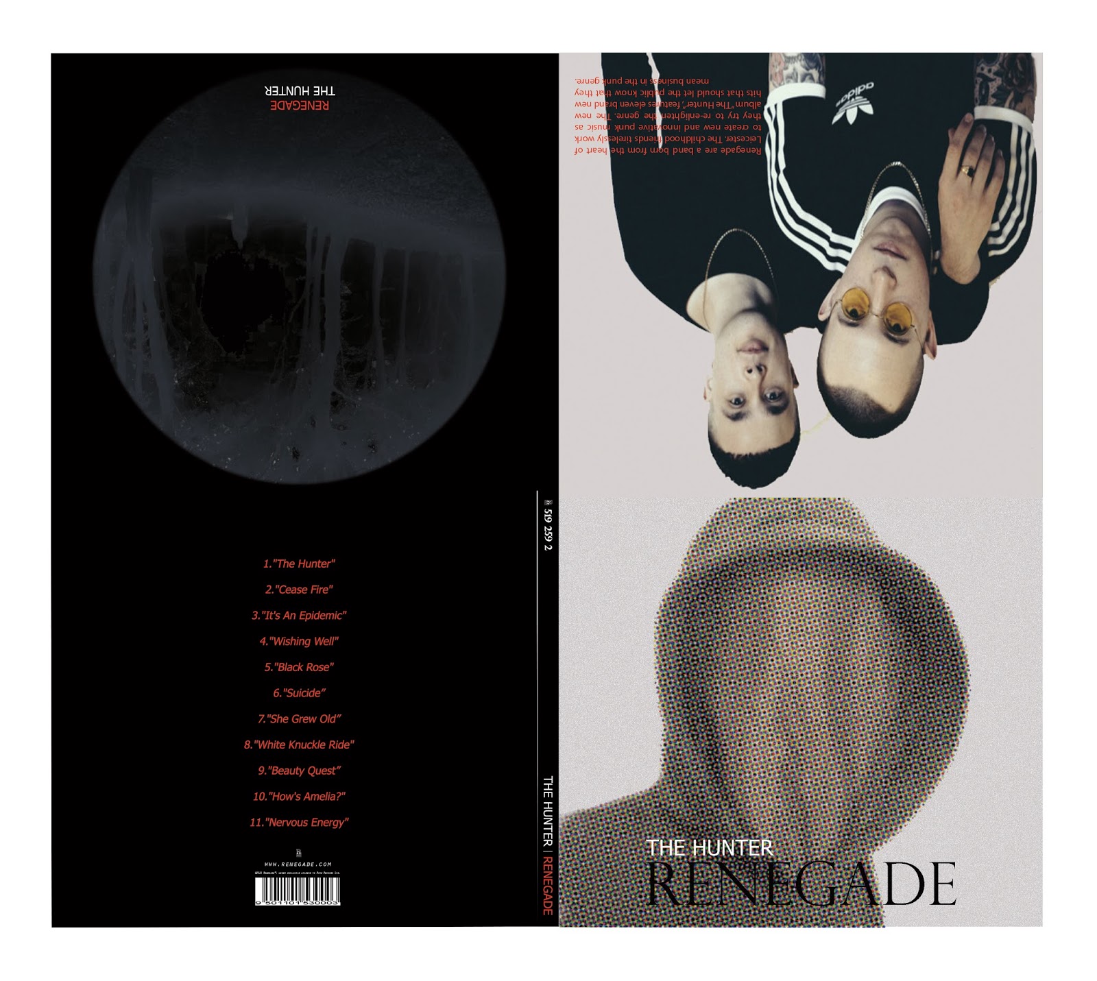
Here is the draft for my Poster and my CD digipak. A band shot is required for my final version for the digipak, a temporary shot of Slaves has been used as this is the framing of the shot that will be similar to my final version. This shot will be taken when the whole band film for the music video, as it is the only time when all members are available together.
Draft Digipak And Magazine Advert - Rayan
As you can see, I haven't completed the spine of the Digipak yet but I know that is something I have to complete and will work on it as soon as possible.
Draft Poster:
There are two variants of my draft magazine advert poster. One variant is with the image I have used on my Digipak cover on a black background in the same colours that I used for the Digipak cover and the second variant is with a background of a picture that I have taken and the lion head is not the same colour, instead I have inverted the colours to get that white finish on it so that it stands out on the background of the poster.
Draft Digipak and Magazine Adverts - Max
IMPORTANT INFORMATION: For an unknown reason, some of the images below may NOT appear on certain browsers (Typically Google Chrome). If the images do not appear, try a different web browser. Internet Explorer usually works.

This was my initial Magazine Advert design. After gain feedback, I was asked to try to implement photography into my design and from here I created a number of alternative designs that used photography in some aspect. I created four magazine adverts in total.
This is the design that I have decided to submit as my draft Magazine Advert.
Thursday, 29 September 2016
Subscribe to:
Posts (Atom)